Logo
Introduction
Our logo is where it all begins – the heart of our visual identity and the first thing most people will associate with wingmaite.
Each version has its own personality and purpose, but they all share the same DNA. Think of these logo elements as the foundation everything else is built on. When used consistently and thoughtfully, they help tell our story even before someone reads a single word about us.
In this section, you'll find everything you need to know about using our logo correctly. We've tried to make it straightforward, but if you ever have questions, just reach out to our brand team – we're here to help!
Brand Mark
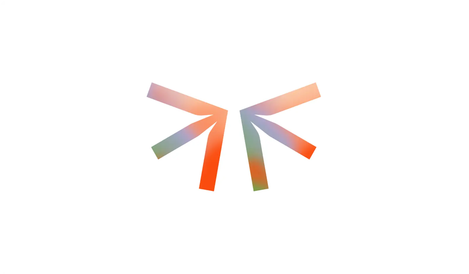
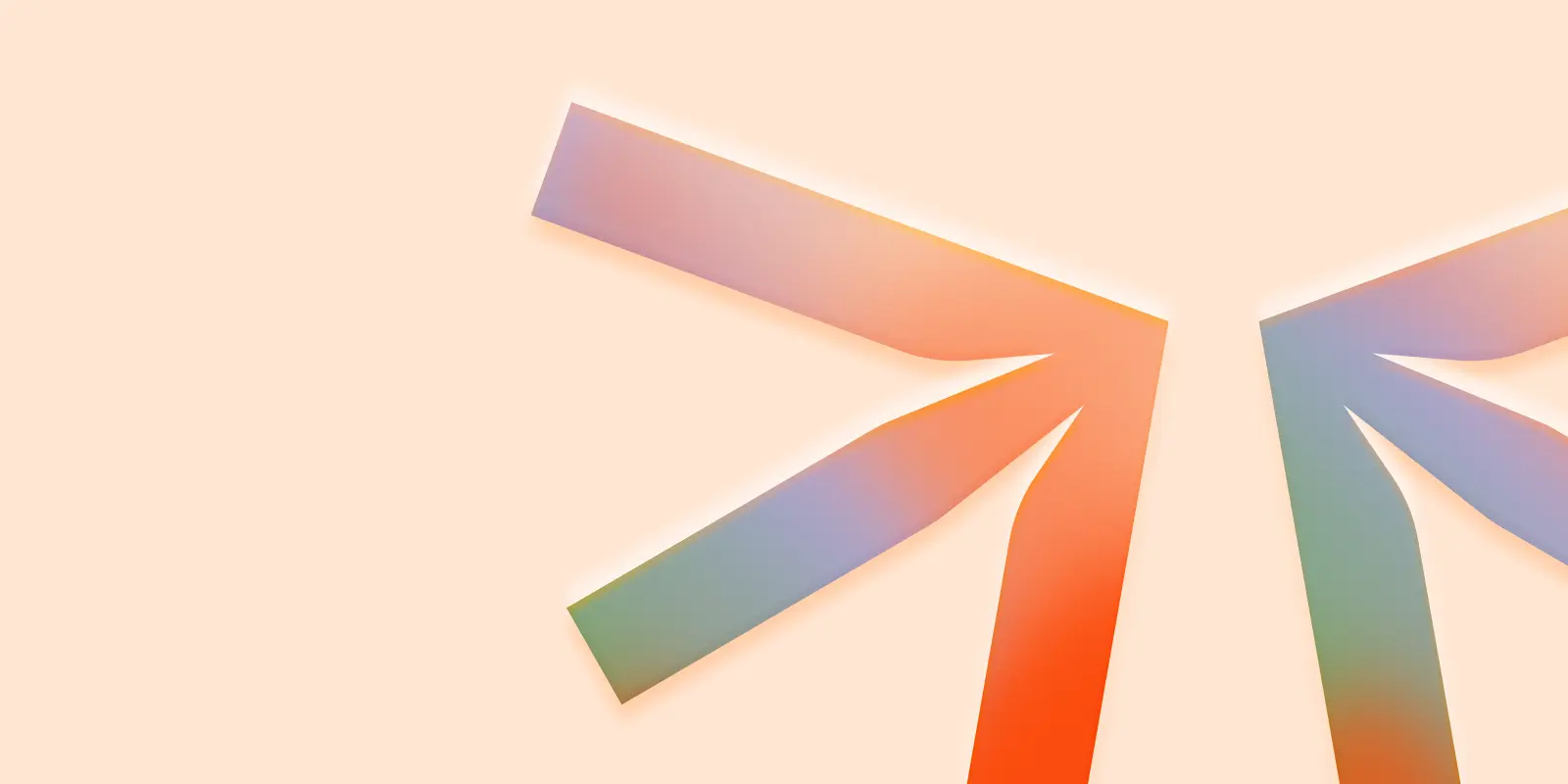
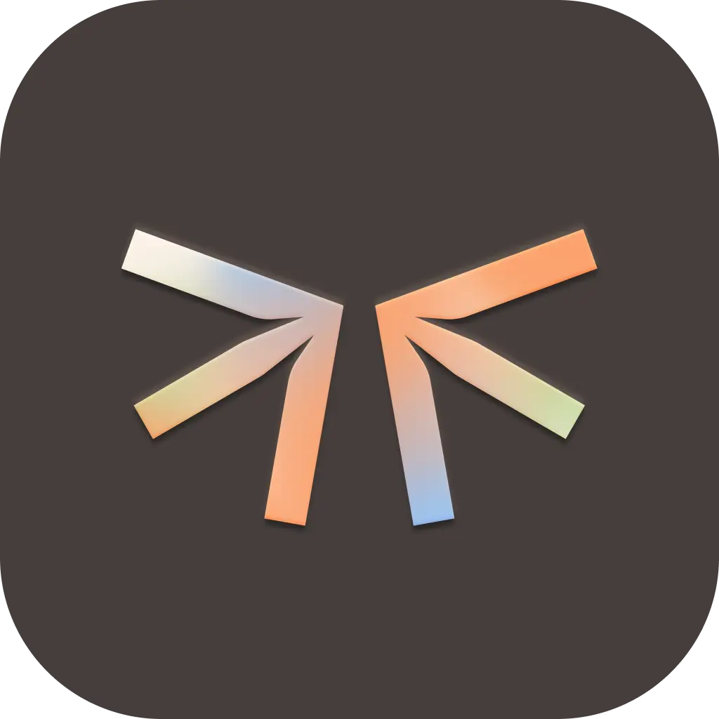
Meet Starling – our brand mark and the starting point of our entire visual identity.
The starling is composed of two arrows pointing inward, forming a pair of stylized wings. This simple yet meaningful symbol represents something we care deeply about: bringing people and technology closer together.
Starling works beautifully on its own when space is limited or when our brand is already established in context. You might spot it as a subtle sign-off in our digital interfaces, as an app icon, or as a playful element in our communications. Pair it with the wordmark when needed. Starling is designed to be flexible and friendly across all touchpoints – just like our product.
Wordmark
Set in Roobert, our wordmark takes this foundational typeface and adds thoughtful custom touches. You might spot it paired with a team member's name and a special connecting version of our Starling symbol - but generally, our wordmark works best as part of our complete lock-up rather than standing alone. It's designed to feel both professional and genuinely approachable.
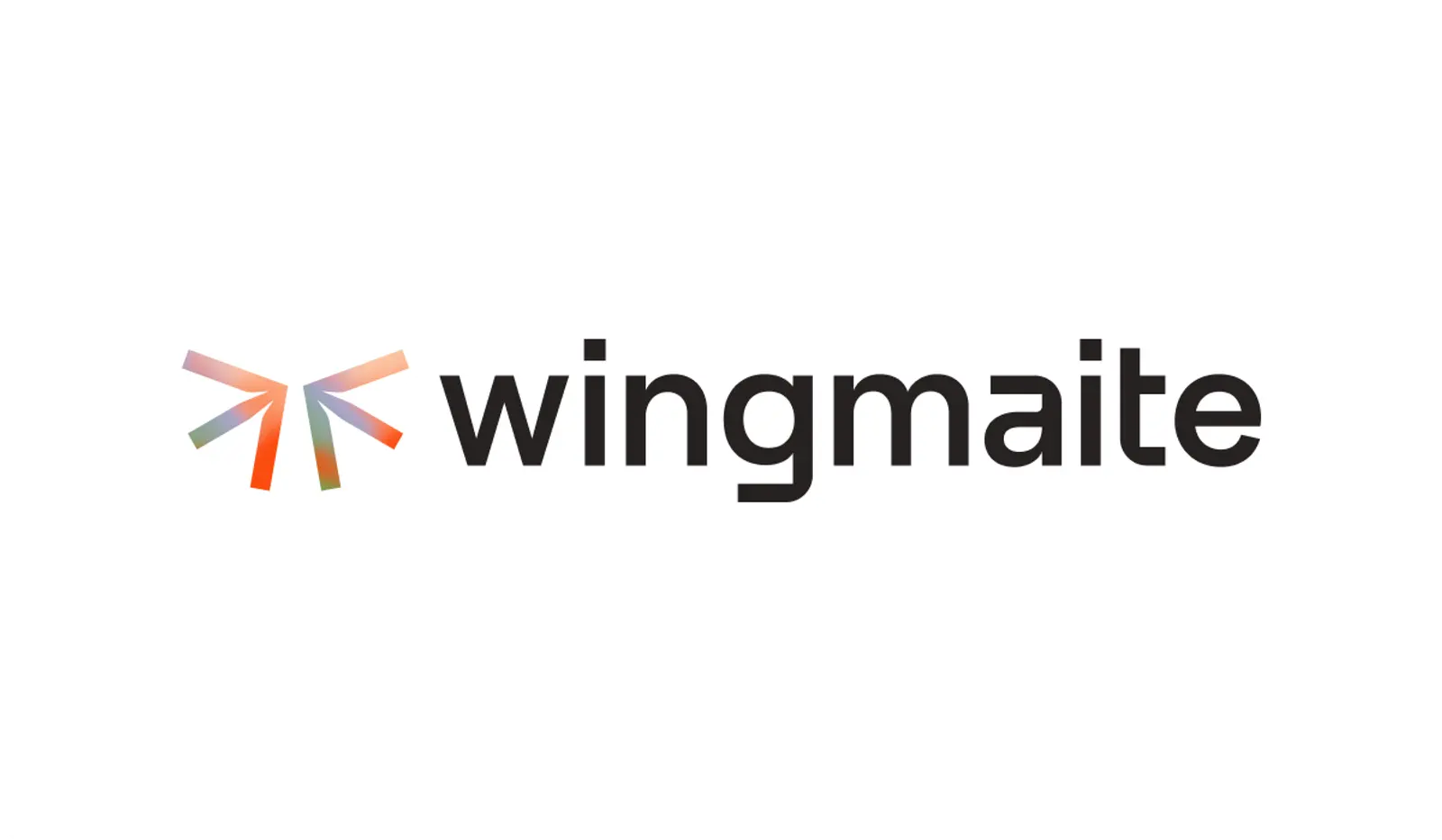
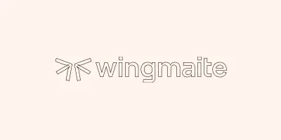
Lock-up / Logo
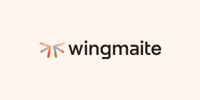
Our lock-up combines the Starling symbol and our wordmark into a complete signature – it's the fullest expression of our brand identity.
The lock-up is our go-to choice for most applications, especially when we're introducing ourselves or need to make a clear brand statement. When in doubt about which logo version to use, the lock-up is usually your best bet!
App Icon
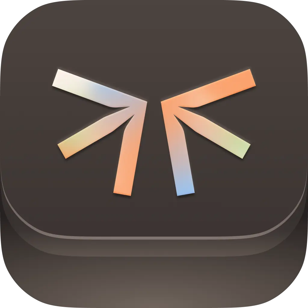
The app icon serves as the brand mark representing wingmaite in a compact and recognizable form. The design incorporates both solid and gradient variations, ensuring flexibility and visibility across different backgrounds.
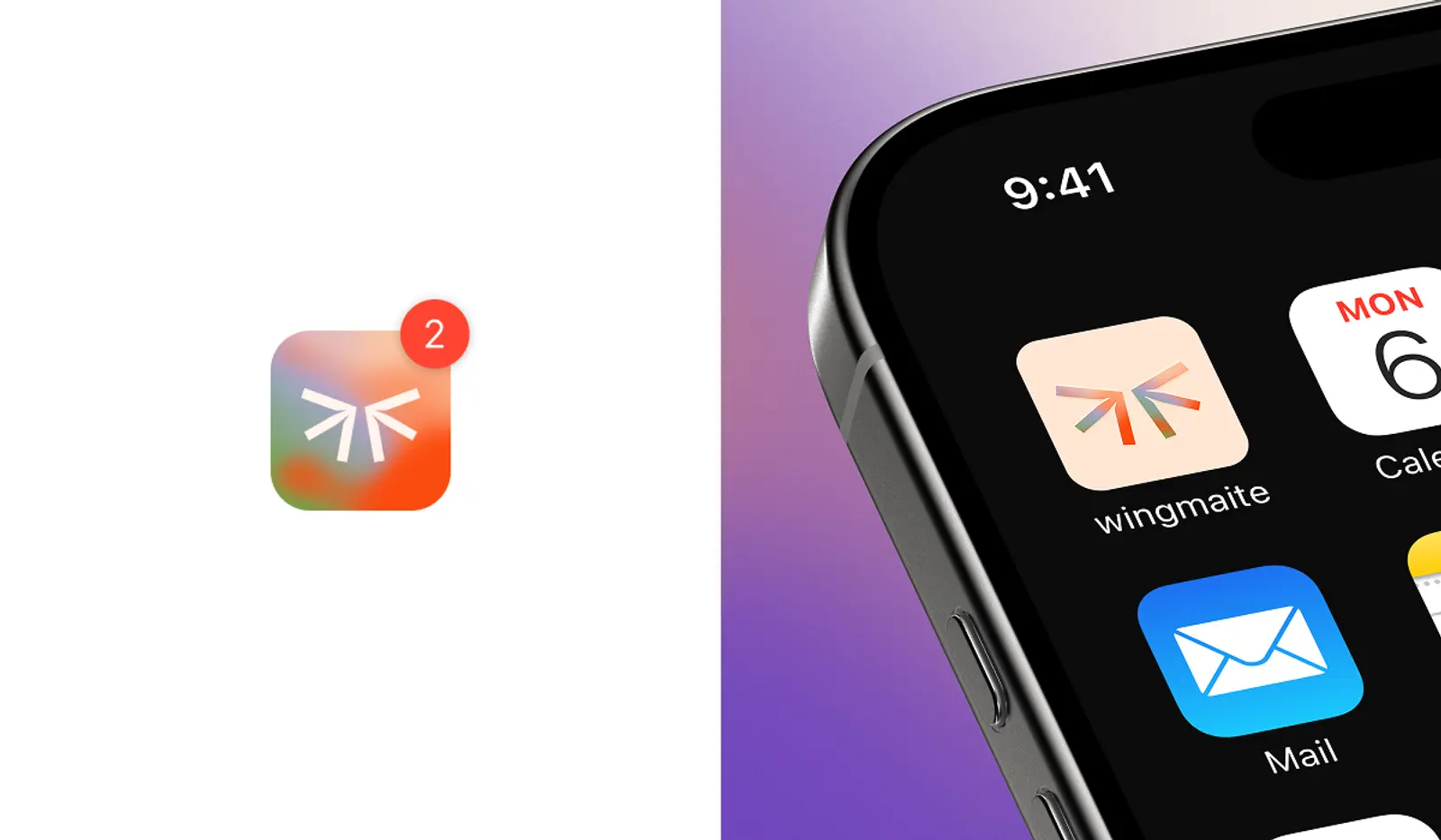
The icons feature a subtle embossed effect on the light and dark versions, while the primary version with the gradient background uses a debossed effect. This is a nod to letterpress printing, which helps create a visual bridge between digital and analog data.

Primary

Light
Dark

Primary 3D

Light 3D
Dark 3D
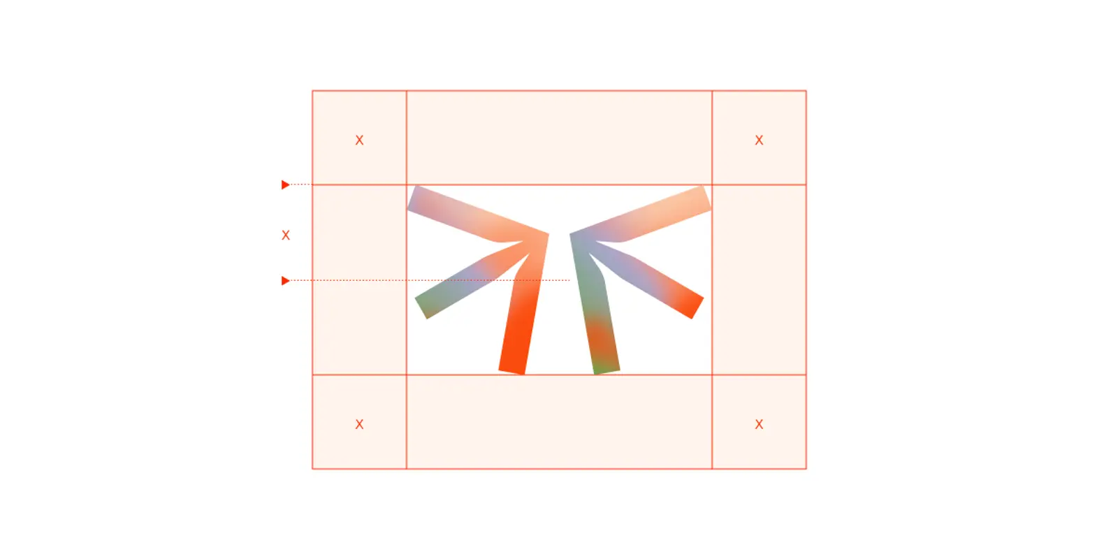
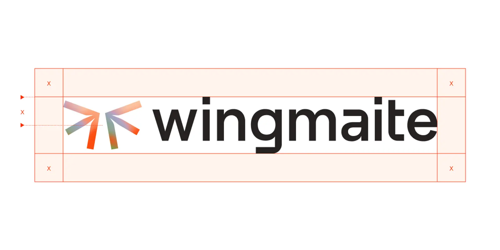
Exclusion Zones
To keep our brand mark and lock-up looking their best, maintain a minimum space around each logo element equal to half the height of the Starling symbol (marked as "X").
This invisible boundary ensures our logo stands out clearly and doesn't get crowded by other design elements, text, or imagery. Respecting it helps maintain our brand's visual impact and readability across all applications. When in doubt, give it a little extra room.
Scale
Our logo has been carefully crafted to look great at any size. While there's no upper limit (go as big as you want), we need to be mindful when things get smaller. That's why we've created clear guidelines for minimum sizes to ensure our brand always stays crisp and recognizable, no matter where it appears.
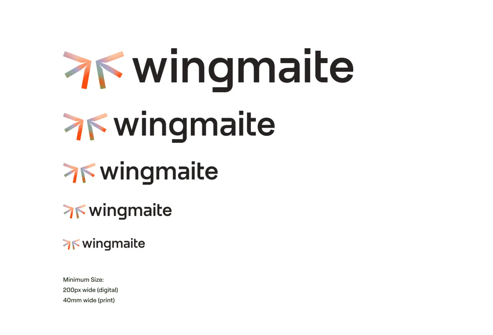
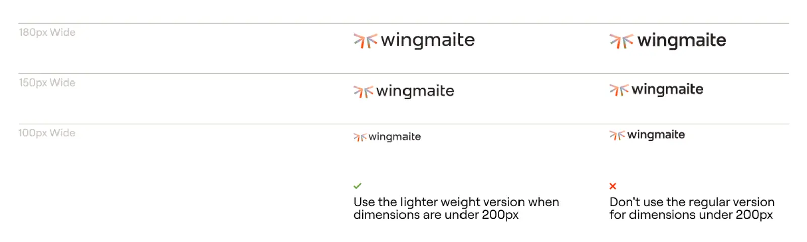
Lighter Weight Version
When space gets tight (specifically for anything under 200px in width), please switch to our special lighter weight version. This alternate design maintains clarity and impact at smaller sizes by subtly adjusting the stroke weights - ensuring we always look sharp and legible, even when we need to squeeze into tighter spots.
Logo Color
Our logo comes in a variety of color options to help you find the perfect fit for any design situation. Think of these as different outfits for our brand – each one appropriate for different contexts while still being unmistakably Wingmaite.
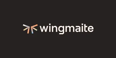
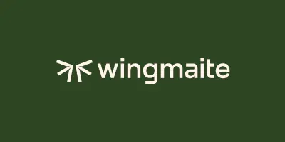
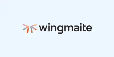
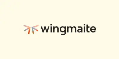
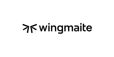
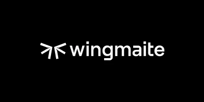
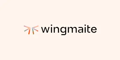
Core Pairings are our go-to choices for most applications. These feature our colorful Starling symbol with our wordmark in dark text against light backgrounds, or white text on dark backgrounds. They're reliable, versatile, and always look great.
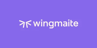
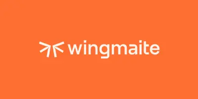
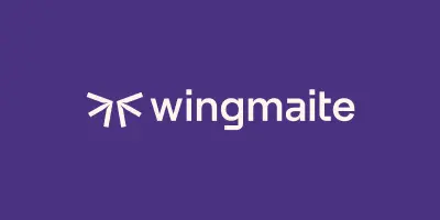
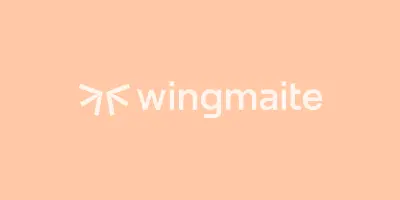
Accent Pairings bring more personality to the table by placing our logo on colored backgrounds from our palette. These are perfect when you want to add a bit more energy or emotional resonance to your designs.
Black & White versions are our simplest options – perfect for when color isn't available or when you need maximum contrast and clarity.
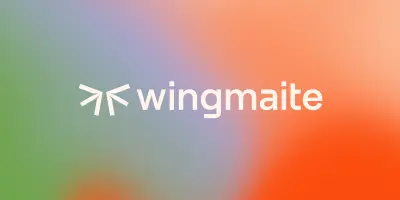
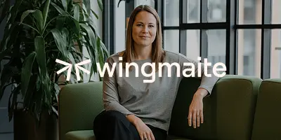
Imagery Backgrounds including both gradients and photographs, add depth and visual interest. When using our logo over these dynamic backgrounds, always opt for the version that provides the best contrast and readability. For gradients and photos alike, our white logo version is often your best friend – it stands out beautifully while letting the background do its thing. Just try to place it in a simpler area of busy photos so it doesn't get lost in the details.
Core Pairings
Accent Pairings
Black & White
Imagery
Logo Dont's
Please don't modify, stretch, recolor, or rearrange our logo elements in ways not shown in these guidelines. When we all use our logo consistently, it helps people recognize us instantly and builds trust in our brand. Please avoid altering it in any way.
Do not use unapproved colors
Do not mix color applications
Do not apply effects
Do not stretch or distort
Do not outline
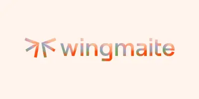
Do not apply the gradient to the wordmark
Do not adjust the weight
Do not use low contrast combinations
Do not adjust the scale